Friday, January 20, 2017

5th Grade: Self-Portraits

Student example
I love so many things about this student's artwork. The muted palette (unusual in elementary), the textural quality of her hair, and how engaged she was in faithfully representing herself!

The first major project in 5th grade is to create a self-portrait that communicates something about you - and interest or belief - while practicing accurate proportions and realistic drawing. We start by investigating artists famous for their self-portraits, with particular emphasis on Frida Kahlo and Vincent van Gogh. I always jump at the chance to include female artists, especially from underrepresented cultures in the Western canon so Frida Kahlo is a perfect fit for this project. It also gives me a chance to dress up as Frida at school on Halloween, so there's that too!

Favorite costume!
Yes, Frida requires some curation on the part of the teacher but her images are so powerful and thought-provoking. Her self-portraits range from dream-like to political and inspire great conversations about her beliefs and background. Vincent van Gogh is so popular, with an equally compelling background, that he must be mentioned in any conversation about self-portraits. Mike Venezia's Getting To Know The Greatest Artists series does such a good job of touching on van Gogh's biography, painting style, and unhappy demise that keeps students engaged in their learning.

After examining examples from art history, students are ready to tackle human proportions and representing the human body in their artwork. My first year doing this project, I did a directed line drawing of a face with guidelines, tutorials on all of the facial features, and reminders to examine your own face in the self-portrait mirror... over 8 times. It makes my voice and hand feel tired again just thinking about it. This year, I tried sharing a Google Slides presentation with my students through Drive (they all have their own Gmail account) but some kids struggled without the in-the-moment reminders about shape and proportion. It is my goal to create a video of myself drawing a human face in proportion and playing it during class so I can also walk around to provide extra support. Now I just have to pluck up the courage to put myself on camera...
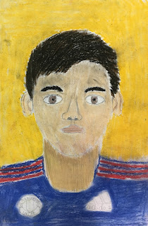
Student example

After students have sketched themselves realistically, working out the kinks of where everything goes and how big each feature should be, they move on to style. In the Google Slides presentation I mentioned above, I included slides featuring some other famous self-portraits. Since students had spent a fair bit of time analyzing Kahlo and van Gogh's styles they were able to pick up on the differences in color palette, realism, and proportion. Students were then able to choose a style to inspire their self-portrait if they didn't want to create a strictly realistic representation. The artists they could choose from were: Frida Kahlo, Vincent van Gogh, Henri Matisse, Chuck Close, and Amadeo Modigliani. Then, of course, there were students who wanted to create their own style and I encouraged it as long as they could explain their inspirations. 
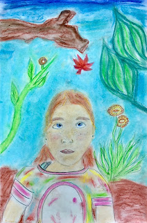
Student example

Last, but not least, students added a background. Like Frida Kahlo, I recommend adding details that communicate an experience, preference, or belief to make the self-portrait meaningful. If the students chose one of the featured artists then they could add a background inspired by their research. Above, the student really took this to heart and did such a great job blending the chalk pastel using color to create contrast and emphasis.

What resources do you use to help students learn proportions and realistically draw faces and people? Any other artists that could be studied for their self-portraits?

Artfully,
Catherine

Tuesday, January 17, 2017

4th Grade: Landscapes


Student landscape example
How gorgeous are those colors?! This project is a labor of love and really challenges students to observe and explore materials.

The first major project in the 4th grade curriculum is a landscape drawing unit. We start out by discussing genres of painting: portrait, still life, and landscape. Then we identify the parts of a landscape: foreground, middle ground, and background. Students view examples of landscapes from different cultures, particularly Western artist Vincent van Gogh and Chinese ink drawings. Students without training tend to render scenes and objects as flat and formless. By examining famous examples from art history, students begin to notice the techniques artists use to render spaces with dimension. Students quickly recognize three techniques to show perspective in a painting.

Vincent Van Gogh, Fishing Boats on the Beach at Saintes-Maries, June 1888, Van Gogh Museum, Amsterdam, Netherlands. (Wikipedia)
Technique #1: Overlapping. Take a look at van Gogh's boats and how only the first boat nearest to the viewer is entirely visible. The artist created perspective and space by hiding parts of the boats behind the first one to make the scene more realistic. Viewers feel like they would have to walk on the beach to see the rest of the boats.

Vincent Van Gogh, Olive Trees with Yellow Sky and Sun, 1889, Metropolitan Museum of Art, New York, USA. (Wikipedia)
Technique #2: Relative size. Place your hand in front of your face and notice its size. Pull your hand back and notice that it now appears smaller. Did your hand actually shrink? Of course not! Your eye sees your hand as smaller to tell your brain that your hand must be further away. Artists place objects that are relatively larger in the foreground, closer to the viewer. Objects that are further away are painted to be smaller. Van Gogh wasn't seeing new, smaller trees in the background, instead he painted them as they appeared to his eye - smaller because they were further away from where he was painting.

Dai Jin, Landscape in the Style of Yan Wengui, Early Ming Dynasty 1368-1644.
Technique #3: Atmospheric perspective. Difficult to pronounce but easy to see. Students will probably notice that objects in the foreground are much more detailed than the objects in the background. Artists may blur objects or use weather elements to suggest depth in their paintings.

Student landscape example
To start this project, students will select a landscape that has meaning to them - a favorite place, somewhere they visited, a home country, etc. Students should bring in a photograph of their chosen place and make sure it features the natural world with a foreground, middle ground, and background. It may be helpful for them and for you as a formative assessment to have students label or somehow identify these areas on their photograph. It is also helpful for students to find the horizon line or place where the flat/foreground elevation meets the vertical/background elevation. Finding this "line" centers students on their paper so they can judge relative size and make room for all of the details. 

Some students will quickly grasp how to incorporate perspective techniques into their drawings. Some students... will not. I was a little alarmed when a particular student couldn't seem to follow the verbal suggestions and demonstrations I did for him individually. Then I remembered my old friend - the critique. I showed the video Austin's Butterfly and modeled constructive criticism for students so they could provide peer feedback for a partner's rough draft sketch. Kids often speak to each other in a way that adults can't access while reinforcing their own understanding. Check out my post about using this video with students of any age - Critique: Using Student Feedback To Encourage Quality Work.

My students added color with chalk pastels and colored pencils. Make sure you demonstrate good practices with the chalk pastels before distributing them to students: dipping in water; applying a few strokes of color and blending; tapping extra dust into the trash rather than blowing onto themselves/their neighbor/your classroom. Colored pencils provide more control for small details - which belong in the... foreground. A colleague used oil pastels finished by blending with baby oil in her classes that produced excellent results. There are so many options here!

Last student example. This was done by a student just looking out the window of the classroom. Love!
Vocabulary
Genre
Landscape
Still Life
Portrait
Foreground
Middle Ground
Background
Perspective
Space
Vincent van Gogh
Overlapping
Relative Size
Atmospheric Perspective
Horizon Line

Do you have any tried and true chalk pastel techniques? With which grades do you explore landscape drawing and painting?

Artfully,
Catherine

Monday, January 16, 2017

To Begin, Begin Again

Isn't this what teaching art is really about?
Image found on Instagram @colourkristina.
They say the path to someplace hot and fiery is paved with good intentions. That's the way it's felt around here as I made the decision to move at the end of this school year, take a soccer coaching position, travel to three different countries, teach, and have a little bit of a life to balance it out. Not that I'm complaining, because all of those things have brought me joy but didn't leave a lot of creative energy for writing and sharing.

I have tons of exciting things happening in my classroom right now so there will be lots to share in the upcoming weeks! In the meantime, here is one of my favorite photos from (one of) the quick trips to Dubai that I took recently.

My own photo taken at sunset on an iPhone from the terrace at Dubai Festival City Mall.
Artfully,
Catherine