Monday, July 17, 2017

PYP Exhibition: Artist Showcase


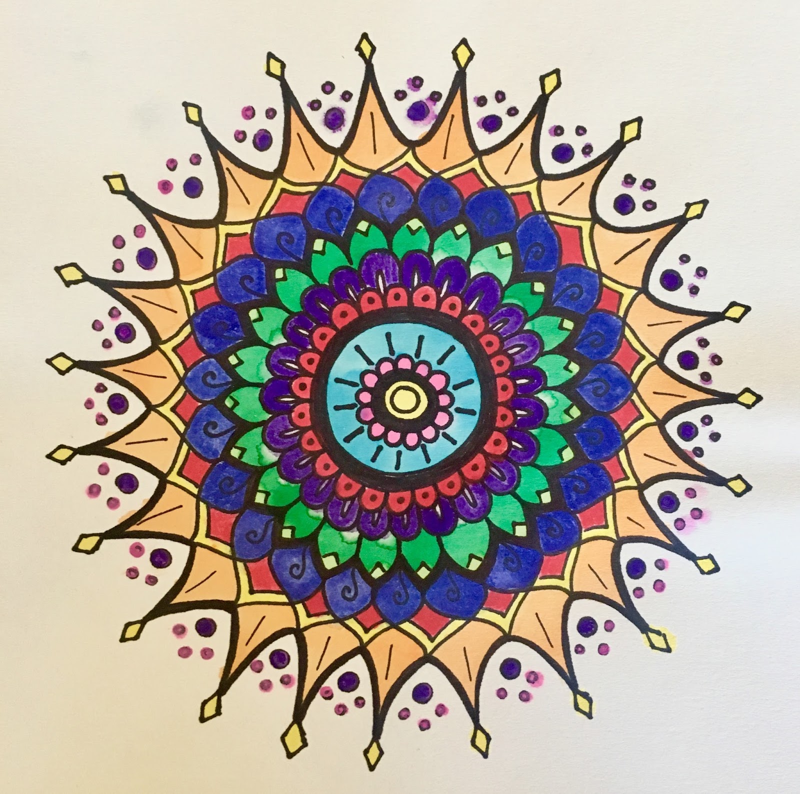
This photo is one of my favorites from my whole teaching career. I learned that there is no limit on students' creativity. They are capable of so much if you let them spread their wings.

As I became more experienced in PYP I realized the need to offer more choice-based options in the art room. Choice on a large scale came to fruition during preparations for the 5th grade PYP Exhibition, which is the final display of learning for the year and is a very self-directed process for the students.

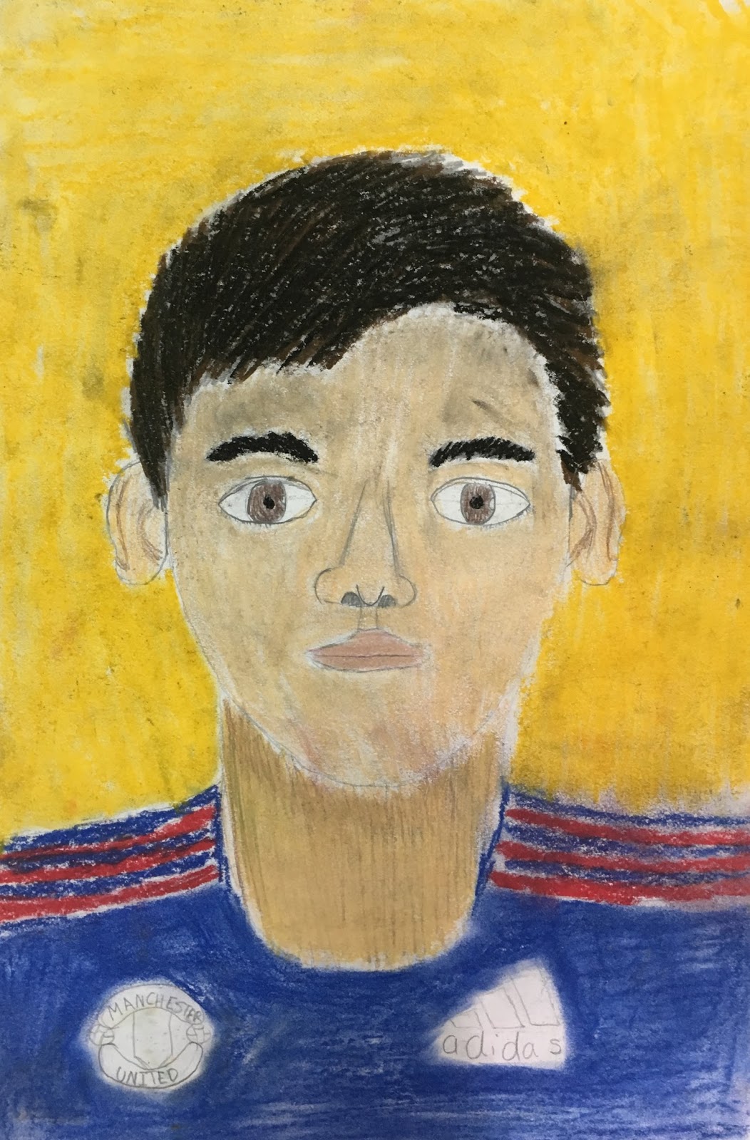
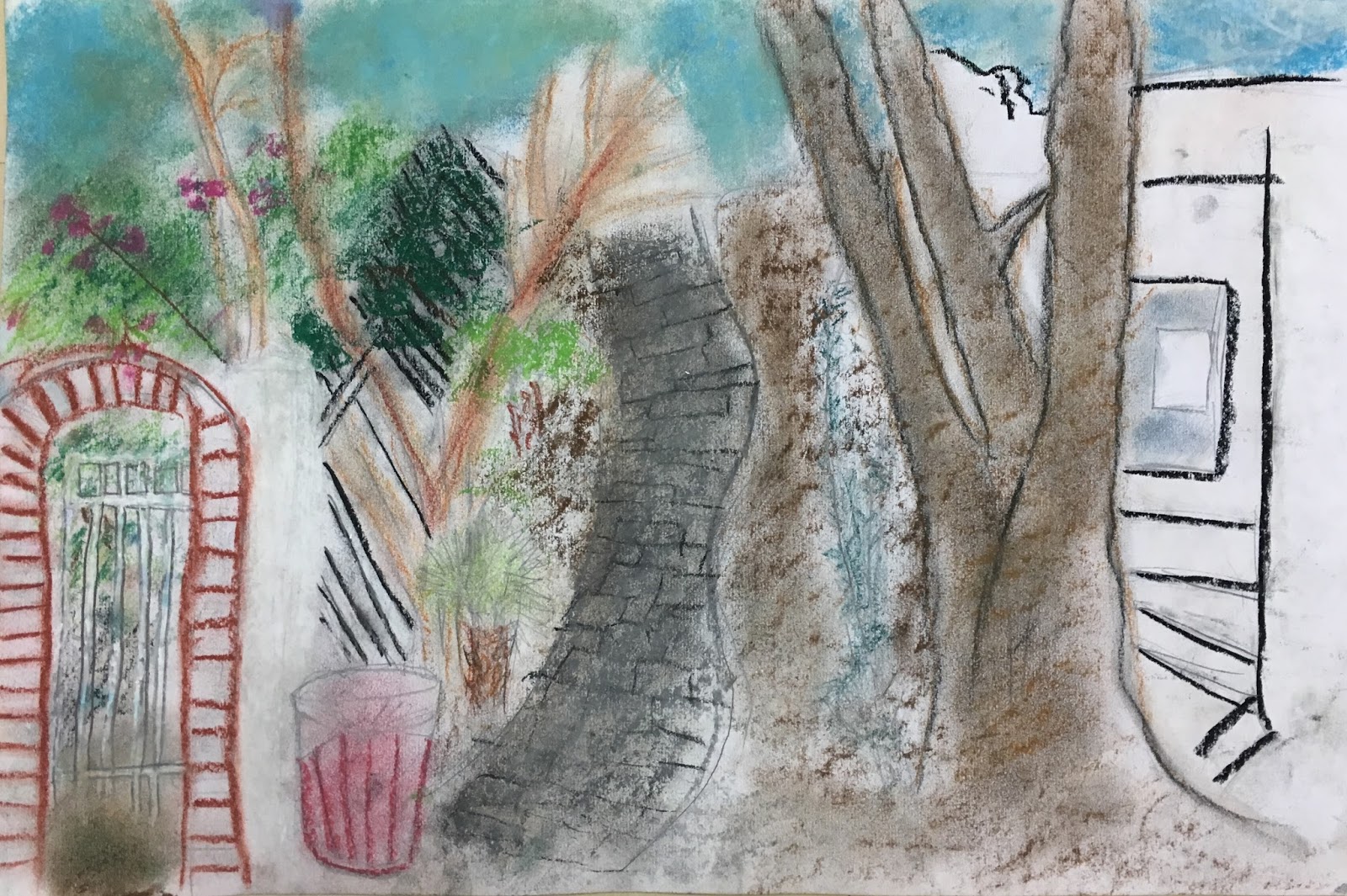
With one month to go before Fine Arts Night, students were tasked with choosing an artist, creating a work inspired by that artist's style, and then, for a little fun, presenting their artwork as if they were their chosen artist. More than an art project and dressing up, students had to research their artist, influences, and the background of the pieces they wanted to focus on. Each student struck out in their own direction and my role was to facilitate. Help them choose materials, point them in the direction of helpful resources, and most of all to have faith in their project.

Since this was my first time completely relinquishing control of a project's outcome I admit there were some jitters on my part. Some of my most promising students struggled to pick just one artist and their challenge was focus and actually completing their work on time. Others had to pick an artist that captured their interest but whose work could also be created with our materials and in our timeframe. Then there were students who just needed to work. Not occupying the peanut gallery for everyone else's project.

Ah! Deep breath. They can do it! Right??

Heck yes, they did! I was so proud of how each student embraced their artist in dress and mannerisms. How they thoughtfully answered people's questions about their work during Fine Arts Night. Not to mention the beautiful artworks that were the highlight of the show and really did their easels proud. 

Got A Wall? Will Paint... A Mural

Hard to capture all of the amazing details in this work when it's in a hallway, but you get the idea!
How would you feel about painting a mural? 
Well, sure, where do you want it to go?
In that area where students enter every morning. It would be nice for the families to see.
The whole hallway? Uh... Let me get on that (right now)!

I've sketched, designed, painted, and collaborated on many artworks but nothing to the scale of what faced me in the school side entrance. My curriculum specialist has nothing if not vision and this was the place to show our school culture. So I embarked on a massive mural project with just a few weeks left of school and lots of excited helpers.

Just getting started

First I sat down with my students and we talked about our school values. What is important to us? What are we working toward? What are we good at? The students brainstormed visuals and buzzwords to get us started. Then students got a blank paper roughly to scale of the wall where we would be working. Each person came up with a design idea to bring all of our thoughts together. Then we shared them, picked and chose what worked best from each design, and reassembled them into our final draft.
Taking shape!
I decided to sketch the design on the wall to manage the scale of the objects because we had such a long space and to unify the overall appearance. Then it was time to block in the major colors (blue, brown, and green for the sky, grass, and tree). After that the real fun came in adding details. A warm color pattern livens up the sun. Flowers dot the grass. Organic swirls playfully mimic tree bark a'la Klimt. Our school mascot, a charming little blue owl, is tucked up in the tree also.

Almost there

The best part was that we finished the mural just as school was finishing so we could celebrate all of our accomplishments that year and it welcomed students back the next.

Art in Action: Exploring Social Justice With Students


Art and creative concepts are pervasive in our everyday culture. Art also offers an accessible lens for people to experience issues of social justice both locally and globally. Even better for our students, art allows students to engage with social justice issues in a meaningful and age-appropriate way.

An issue near and dear to the hearts of our school community was the plight of animal welfare both on our school campus and in the city where we lived. Stray cats could be found in every neighborhood and around every dumpster. Further afield, stray dogs and their puppies could sometimes escape notice but were very often confronted by human activities. Adding to the issue was the fact that the local government (not in America) did not have any laws or policies accounting for animal welfare or control. What can people who love animals but don't have widespread governmental support do to help? Investigate, reflect, connect, and then act.

Students knew that animal welfare was a problem both on our campus and in the community because they could see it with their own eyes. This made them think about the harsh reality of these animals' lives, how animals were both helped and hurt by humans, and who was already working on these issues. So we connected with local animal rescue groups and asked what we could do to help. They gave us the following suggestions:
  • TNR (trap, neuter, release) the cats already living on our school campus so they wouldn't continue to breed, stayed healthier, and established a stable territory.
  • Make a commitment to your own pets so that they don't get lost or abandoned.
  • Donate time and money to animal rescue groups so they could continue their invaluable work.
With our plan of action, we began creating artworks inspired by animals to draw attention to the issue of animal welfare in our community. We decided to sell these artworks at the school's annual Friendship Festival to raise money for our TNR campaign and to make a donation to the rescue groups already in operation. Didn't they do a spectacular job?!


I am proud to say that through our school group's efforts from the sale of artwork, hosting a craft booth at Friendship Festival, and organizing other student events we were able to raise almost $10,000. I can't wait to see what these kids are capable of as they grow and continue to fight for change.

Art Teacher Inspiration: Bulletin Boards


Hanging artwork is both a joy and a chore for art teachers. You are proud of your students' work and want to share their successes with the school community. At the same time, it means wrestling with massive bulletin boards that look beautiful for the first 10 minutes after you cover them in preparation for displaying work. Then school life happens and you spend the rest of the year waging war with your stapler on curling or torn corners and faded spots where the artwork has been hanging. Some people cleverly use fabric as a more durable option - until the fire marshal says no - and then you wrack your brain because no art teacher is ever defeated in the quest for a creative solution.

Enter... PAINTED BULLETIN BOARDS!

Wait, you can paint on those? Yup! And oh, they will be glorious. Here are two more that I loved from my painting campaign.


Have any big gallons of tempera that are about to go off? This is your project. The cork will absorb a fair bit of paint but if you work quickly you can still get decent coverage. To create a visually interesting background that doesn't distract from students' work I would use 2-3 colors that blended nicely (art vocabulary = analogous) and applied it in an abstract, swirling pattern. This project was like an adult coloring book: so relaxing yet you are accomplishing so much. 

Want to run this idea by your principal and hope they say yes? Just hit them with these (totally legitimate, inspired) reasons:
  • Painting bulletin boards is cost effective in the long run because it uses fewer materials and doesn't need to be replaced for several years. You might end up re-touching spots but not the whole board.
  • The boards look good all year round. Whether it's the beginning of the year, end of the year, or time between projects, these boards are beautiful ALL THE TIME. At one of my schools, the administrators made me keep the art show up through the summer. No one wants to look at last year's art in August and what about the poor kids who move or want to enjoy their art?!
  • Reduces waste by allowing you to use old paint or donations from the school community. This doesn't have to be an expensive endeavor!
  • Involves the community. I was lucky to have a helpful maintenance crew who took the boards down for me to work on them and re-hung them when I was finished (24 boards in total, bless their hearts). While I was working I kept my door open and people popped in to watch and admire. The results are stunning so show off your process to build interest in your program!

Monday, July 10, 2017

Art History Alive


This project will test your organizational skills and patience because it's a rather large-scale work but the end product is exceptional and students will learn so much art history!

Art History Alive is a project I inherited so the credit for this idea goes to those who came before me. The concept is simple - students re-create a famous portrait in life size and they are challenged to paint and pose as close to the original as possible. Students also create a presentation about their chosen artist describe the artist's life, style, and significance.

Here is the process that students went through to create their final compositions. I've also included some words of warning to help you and your students avoid potential pitfalls.


  1. Students form groups of no more than four people. Work must be divided between all members for both the painting, research, and presentation portions of the project.
  2. Students select a famous portrait and its artist as the focus of their project. Make sure it is the original painting and hasn't been copied or photo edited by anyone else. Click here for reputable sources to find an artwork.
  3. Students paint the portrait's background approximately 2-3 yards long on bulletin board or heavy duty paper. Any details that cannot be re-created physically should also be painted into the background. Remind your students to mix paint on their palette rather than the paper because too much paint/too many layers on such a large work can lead to rips and holes.
  4. Students will gather objects, furniture, and accessories to complete the portrait and pose for a photo reproduction.
  5. Students will research their chosen artist and create a presentation to be shared with the class including the following information:
    1. Biographic information (birth and death, nationality and residence, relevant spouses, etc)
    2. Art style - DESCRIBE this style and what makes it unique.
    3. Influences - other artists that worked at the same time or came before this artist that helped them develop.
    4. Major artworks - which ones are in museums or important for people to know about?
    5. Interesting facts - did they accomplish something important or do anything crazy during their life (most famous artists have at least one skeleton in their closet).
    6. Not-so-gentle reminder: plagiarism is a crime and indicates that you don't understand what you've been learning because you can't put it in your own words. If something sounds good but doesn't make sense keep looking for a resource that explains it in a way that you understand. You should be able to define every word you use to describe your artist. Also, CITE YOUR SOURCES.

Mandala, Mandala, Mandala


Mandalas: simple lines and shapes that add up an intricate, gorgeous composition that blows audiences away. Not to mention the therapeutic benefits for the artist. Toward the end of the year the noise level is on the rise as schedules are disrupted for special events, students start mentally checking out of school, and attention spans are short. Enter: mandalas. It's almost impossible to stay stressed or distracted while you are embarking on mandala-making.

Video accessed on YouTube.

If you break mandalas down to their most basic elements they are made of repeating simple lines and shapes. What is not so simple, for some, is to repeat those simple lines and shapes so they are the same size all the way around the design. Artists combat this in a few different ways. You can draw concentric circles with a compass or trace and transfer a section that you like. Or you can follow artist Elsa Rhae (video above) and make lemonade from lemons if one of your shapes gets too big or too small. 

One trick I have my students do, after they've cut their paper into a square, is to use a straight-edge to find the center of the paper by drawing diagonal lines from the corners. Then they are free to build out from that center point with curved lines, spirals, petals, tear drops, and any other pattern they can think of. Some students prefer to work in pencil while others enjoy the challenge of using Sharpies right away. After the design is inked and any stray pencil marks are erased it's time to add color. At the top of the post, the first example was completed using watercolor pencils, which gives a bit more control but still has the tendency to leak. My students loved the tie-dye effects of using watercolor paint and pipettes. 


Here's what we've done so far:
  1. Start with a square piece of watercolor paper of any size. The bigger the paper the more room you have for layers of design.
  2. Find the center of your paper by making soft diagonal lines with a pencil from opposite corners of the paper. Where they intersect is the center.
  3. Choose a dot, spiral, or center shape of your choice. Continue building out the layers until you are happy with the shape of your mandala. 
  4. If you worked in pencil, re-trace your design with Sharpie. Then erase any stray pencil lines.
Now for the magic part aka beautiful color blending that you don't totally control:
  1. Take your paper to the sink and run it under water until the whole surface is wet. Since you used watercolor paper this step won't hurt your design!
  2. Lay your wet paper on top of paper towel and return to your liquid watercolor paints.
  3. (Before you wet your paper) Choose 3-4 colors that are analogous or close to each other on the color wheel. One color can be more complementary (like the pink and green above) but they will need a color buffer when you apply the paint.
  4. Keep a cup of clean water to wash out the pipette between colors.
  5. Use the pipette to apply drops of color scattered around your paper. Leave some white space so that the other colors you chose will have a place to shine before blending with colors you've already applied.
Vocabulary
Mandala
Radial Balance

Cultural Significance
Mandalas refer generally to repeating patterns around a center point, showing radial balance. These designs are especially important in Hinduism and Buddhism and examples can also be found in Christianity. In all religions, the circular arrangement of the design represents the universe and contemplating these forms can be meditative or a reference to the journey between the earthly and the divine. 


Animal Textile Mixed Media Compositions


Animal Textile Mixed Media Composition - I really need to find a more succinct name for this awesome project. Students study Islamic art and design principles, connect their learning to a habitat, and then put it all together with an array of materials. Students love all of the choice in this project and the results are stunning.

 
Accessed at www.patterninislamicart.com
As a starting point, students learn the different motifs that make up traditional Islamic design. These are easy to distinguish but it's important vocabulary for students to develop so they are accurately able to describe what they see. We also discuss some of the religious implications that set Islamic designs apart from other artistic traditions - namely, that humans and animals are very rare except in stylized forms. 

Depending on the amount of time we have for this unit, I like to discuss how ideas migrate to influence artists and their products. This is a great time to make a connection between art and world history by examining the Silk Road. Here is a video from Crash Course World History, hosted by the John Green of Paper Towns fame, that gives students a brief intro to this complex system of trade and the spread of ideas.


Then students "migrate" a piece of A4 paper around their table after first folding it into quarters and creating a design of their choosing in the first box. The second student who gets the paper will take design ideas they like from the first design but reimagine it a bit in the next box on the paper. This continues until all of the boxes have a design in them. If students finish their designs before it's time to pass then they can add color and more detail. 

But let's get back to the main project of this unit - the mixed media compositions. These are the steps students go through to create their final artwork:
  1. Choose a traditional Islamic design for your background. Which motif does it show? Calligraphy, geometric, or arabesque?
  2. Sketch your design on an A3 background paper in pencil. Your design may be simplified to allow better color application later.
  3. Add color to your background with acrylic paint. Are all of your pencil lines covered up?
  4. Research and select an animal from the desert habitat to feature as your subject.
  5. Practice and then sketch your animal using either charcoal, ink, or colored pencils.* Did you add details that give the animal form and texture?
  6. Cut out and attach your animal to the background. Take care if you used charcoal that your sketch didn't smudge.
Here are two student examples.


Are your students struggling with realism in their drawing? Students usually work from reference photos and I show them the video "Austin's Butterfly" as a reminder to use careful observation when developing realism. Students also benefit from the act of critique during this project to practice looking carefully at others' work and reflecting on their own drawings.

Friday, January 20, 2017

5th Grade: Self-Portraits

Student example
I love so many things about this student's artwork. The muted palette (unusual in elementary), the textural quality of her hair, and how engaged she was in faithfully representing herself!

The first major project in 5th grade is to create a self-portrait that communicates something about you - and interest or belief - while practicing accurate proportions and realistic drawing. We start by investigating artists famous for their self-portraits, with particular emphasis on Frida Kahlo and Vincent van Gogh. I always jump at the chance to include female artists, especially from underrepresented cultures in the Western canon so Frida Kahlo is a perfect fit for this project. It also gives me a chance to dress up as Frida at school on Halloween, so there's that too!

Favorite costume!
Yes, Frida requires some curation on the part of the teacher but her images are so powerful and thought-provoking. Her self-portraits range from dream-like to political and inspire great conversations about her beliefs and background. Vincent van Gogh is so popular, with an equally compelling background, that he must be mentioned in any conversation about self-portraits. Mike Venezia's Getting To Know The Greatest Artists series does such a good job of touching on van Gogh's biography, painting style, and unhappy demise that keeps students engaged in their learning.

After examining examples from art history, students are ready to tackle human proportions and representing the human body in their artwork. My first year doing this project, I did a directed line drawing of a face with guidelines, tutorials on all of the facial features, and reminders to examine your own face in the self-portrait mirror... over 8 times. It makes my voice and hand feel tired again just thinking about it. This year, I tried sharing a Google Slides presentation with my students through Drive (they all have their own Gmail account) but some kids struggled without the in-the-moment reminders about shape and proportion. It is my goal to create a video of myself drawing a human face in proportion and playing it during class so I can also walk around to provide extra support. Now I just have to pluck up the courage to put myself on camera...

Student example

After students have sketched themselves realistically, working out the kinks of where everything goes and how big each feature should be, they move on to style. In the Google Slides presentation I mentioned above, I included slides featuring some other famous self-portraits. Since students had spent a fair bit of time analyzing Kahlo and van Gogh's styles they were able to pick up on the differences in color palette, realism, and proportion. Students were then able to choose a style to inspire their self-portrait if they didn't want to create a strictly realistic representation. The artists they could choose from were: Frida Kahlo, Vincent van Gogh, Henri Matisse, Chuck Close, and Amadeo Modigliani. Then, of course, there were students who wanted to create their own style and I encouraged it as long as they could explain their inspirations. 

Student example

Last, but not least, students added a background. Like Frida Kahlo, I recommend adding details that communicate an experience, preference, or belief to make the self-portrait meaningful. If the students chose one of the featured artists then they could add a background inspired by their research. Above, the student really took this to heart and did such a great job blending the chalk pastel using color to create contrast and emphasis.

What resources do you use to help students learn proportions and realistically draw faces and people? Any other artists that could be studied for their self-portraits?

Artfully,
Catherine

Tuesday, January 17, 2017

4th Grade: Landscapes


Student landscape example
How gorgeous are those colors?! This project is a labor of love and really challenges students to observe and explore materials.

The first major project in the 4th grade curriculum is a landscape drawing unit. We start out by discussing genres of painting: portrait, still life, and landscape. Then we identify the parts of a landscape: foreground, middle ground, and background. Students view examples of landscapes from different cultures, particularly Western artist Vincent van Gogh and Chinese ink drawings. Students without training tend to render scenes and objects as flat and formless. By examining famous examples from art history, students begin to notice the techniques artists use to render spaces with dimension. Students quickly recognize three techniques to show perspective in a painting.

Vincent Van Gogh, Fishing Boats on the Beach at Saintes-Maries, June 1888, Van Gogh Museum, Amsterdam, Netherlands. (Wikipedia)
Technique #1: Overlapping. Take a look at van Gogh's boats and how only the first boat nearest to the viewer is entirely visible. The artist created perspective and space by hiding parts of the boats behind the first one to make the scene more realistic. Viewers feel like they would have to walk on the beach to see the rest of the boats.

Vincent Van Gogh, Olive Trees with Yellow Sky and Sun, 1889, Metropolitan Museum of Art, New York, USA. (Wikipedia)
Technique #2: Relative size. Place your hand in front of your face and notice its size. Pull your hand back and notice that it now appears smaller. Did your hand actually shrink? Of course not! Your eye sees your hand as smaller to tell your brain that your hand must be further away. Artists place objects that are relatively larger in the foreground, closer to the viewer. Objects that are further away are painted to be smaller. Van Gogh wasn't seeing new, smaller trees in the background, instead he painted them as they appeared to his eye - smaller because they were further away from where he was painting.

Dai Jin, Landscape in the Style of Yan Wengui, Early Ming Dynasty 1368-1644.
Technique #3: Atmospheric perspective. Difficult to pronounce but easy to see. Students will probably notice that objects in the foreground are much more detailed than the objects in the background. Artists may blur objects or use weather elements to suggest depth in their paintings.

Student landscape example
To start this project, students will select a landscape that has meaning to them - a favorite place, somewhere they visited, a home country, etc. Students should bring in a photograph of their chosen place and make sure it features the natural world with a foreground, middle ground, and background. It may be helpful for them and for you as a formative assessment to have students label or somehow identify these areas on their photograph. It is also helpful for students to find the horizon line or place where the flat/foreground elevation meets the vertical/background elevation. Finding this "line" centers students on their paper so they can judge relative size and make room for all of the details. 

Some students will quickly grasp how to incorporate perspective techniques into their drawings. Some students... will not. I was a little alarmed when a particular student couldn't seem to follow the verbal suggestions and demonstrations I did for him individually. Then I remembered my old friend - the critique. I showed the video Austin's Butterfly and modeled constructive criticism for students so they could provide peer feedback for a partner's rough draft sketch. Kids often speak to each other in a way that adults can't access while reinforcing their own understanding. Check out my post about using this video with students of any age - Critique: Using Student Feedback To Encourage Quality Work.

My students added color with chalk pastels and colored pencils. Make sure you demonstrate good practices with the chalk pastels before distributing them to students: dipping in water; applying a few strokes of color and blending; tapping extra dust into the trash rather than blowing onto themselves/their neighbor/your classroom. Colored pencils provide more control for small details - which belong in the... foreground. A colleague used oil pastels finished by blending with baby oil in her classes that produced excellent results. There are so many options here!

Last student example. This was done by a student just looking out the window of the classroom. Love!
Vocabulary
Genre
Landscape
Still Life
Portrait
Foreground
Middle Ground
Background
Perspective
Space
Vincent van Gogh
Overlapping
Relative Size
Atmospheric Perspective
Horizon Line

Do you have any tried and true chalk pastel techniques? With which grades do you explore landscape drawing and painting?

Artfully,
Catherine

Monday, January 16, 2017

To Begin, Begin Again

Isn't this what teaching art is really about?
Image found on Instagram @colourkristina.
They say the path to someplace hot and fiery is paved with good intentions. That's the way it's felt around here as I made the decision to move at the end of this school year, take a soccer coaching position, travel to three different countries, teach, and have a little bit of a life to balance it out. Not that I'm complaining, because all of those things have brought me joy but didn't leave a lot of creative energy for writing and sharing.

I have tons of exciting things happening in my classroom right now so there will be lots to share in the upcoming weeks! In the meantime, here is one of my favorite photos from (one of) the quick trips to Dubai that I took recently.

My own photo taken at sunset on an iPhone from the terrace at Dubai Festival City Mall.
Artfully,
Catherine